Klipboard Product Finder
Klipboard provides industry-specific, cloud-based ERP and management
software solutions for businesses
Industry
Software Development
My role
Timeline:
UI Designer
9 Months (2025 - present)

Context
The Problem
Klipboard is a cloud-based ERP and workforce management platform built for field service businesses. Their software covers a broad range of industries, from facilities management and HVAC to construction and logistics, each with their own set of relevant products and solutions.
As Klipboard's product range grew, so did the challenge of helping new visitors find what was actually relevant to them. A visitor landing on the site from a Google search for "field service software" had no structured way to narrow down to the right industry or product without scrolling through a complex main navigation.
Klipboard's existing website navigation had scaled past the point of usability. New visitors struggled to self-identify which product or industry solution matched their needs, while returning users found it difficult to re-locate specific pages quickly. With new product categories planned for the near future, the navigation risked becoming a genuine barrier to conversion, not just a friction point.
The business needed a solution that could handle their current complexity and accommodate future growth without requiring a full navigation redesign every time a new product was added.
My Role
As the UI Designer on this project, I was responsible for the end-to-end design of the Product Finder tool, from research and concept through to high-fidelity design and handoff. The initial wireframes were provided by the broader MO Agency design team, which I then took forward into detailed UI design.
Brainstorming and wireframing
The Wireframes were provided by the designers of the MO Agency team.
View more projects

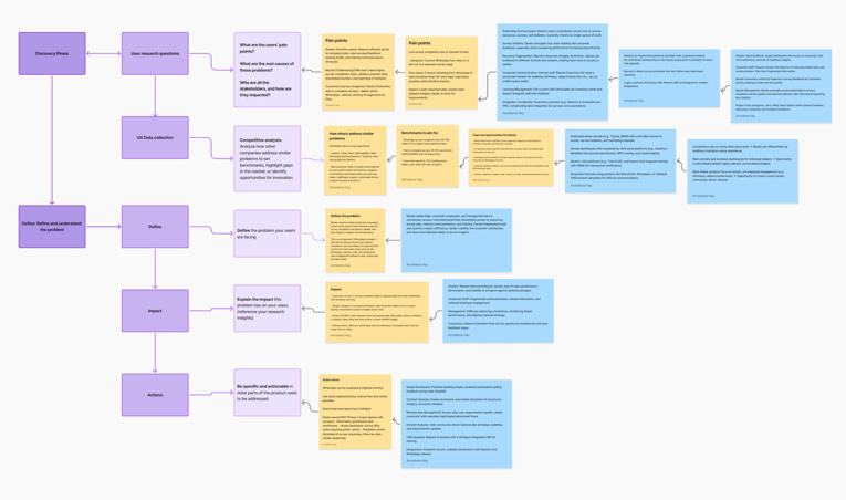
Research method: Competitor Analysis
With no direct user interviews conducted at this stage, the research phase focused on a structured competitor analysis of software companies offering multiple products across multiple industries, a directly comparable problem space.
I analysed how competitors help users self-identify their needs quickly, where and how product discovery tools are positioned on the page, what interaction patterns they use (filters, guided questions, search, dropdowns), and how visual design supports clarity and decision-making under cognitive load.
What the research revealed:
Most competitors fell into one of two camps. Either they used a flat mega-menu that exposed everything at once (overwhelming for new visitors) or they buried product discovery behind a search bar, which requires users to already know what they're looking for.
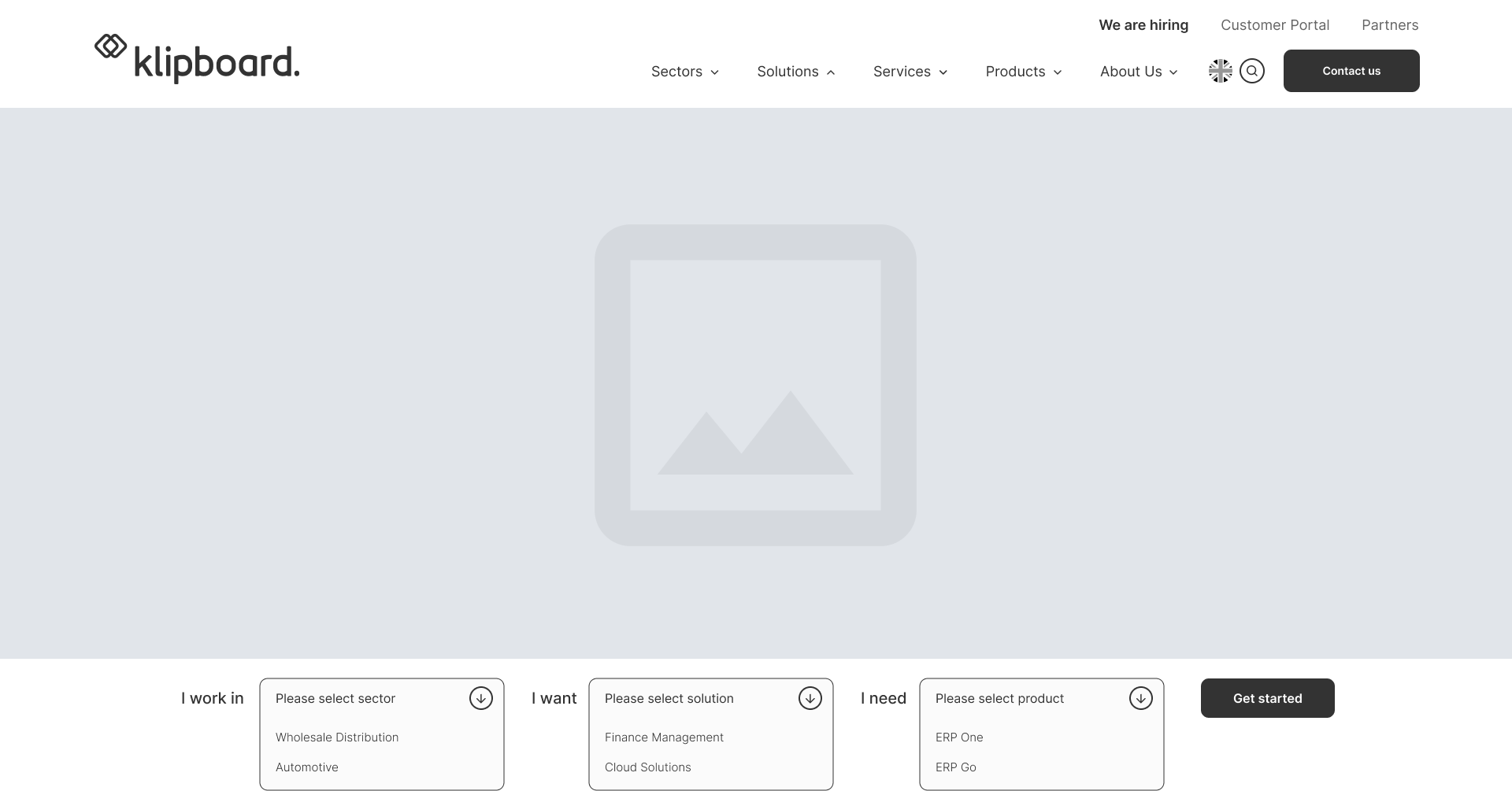
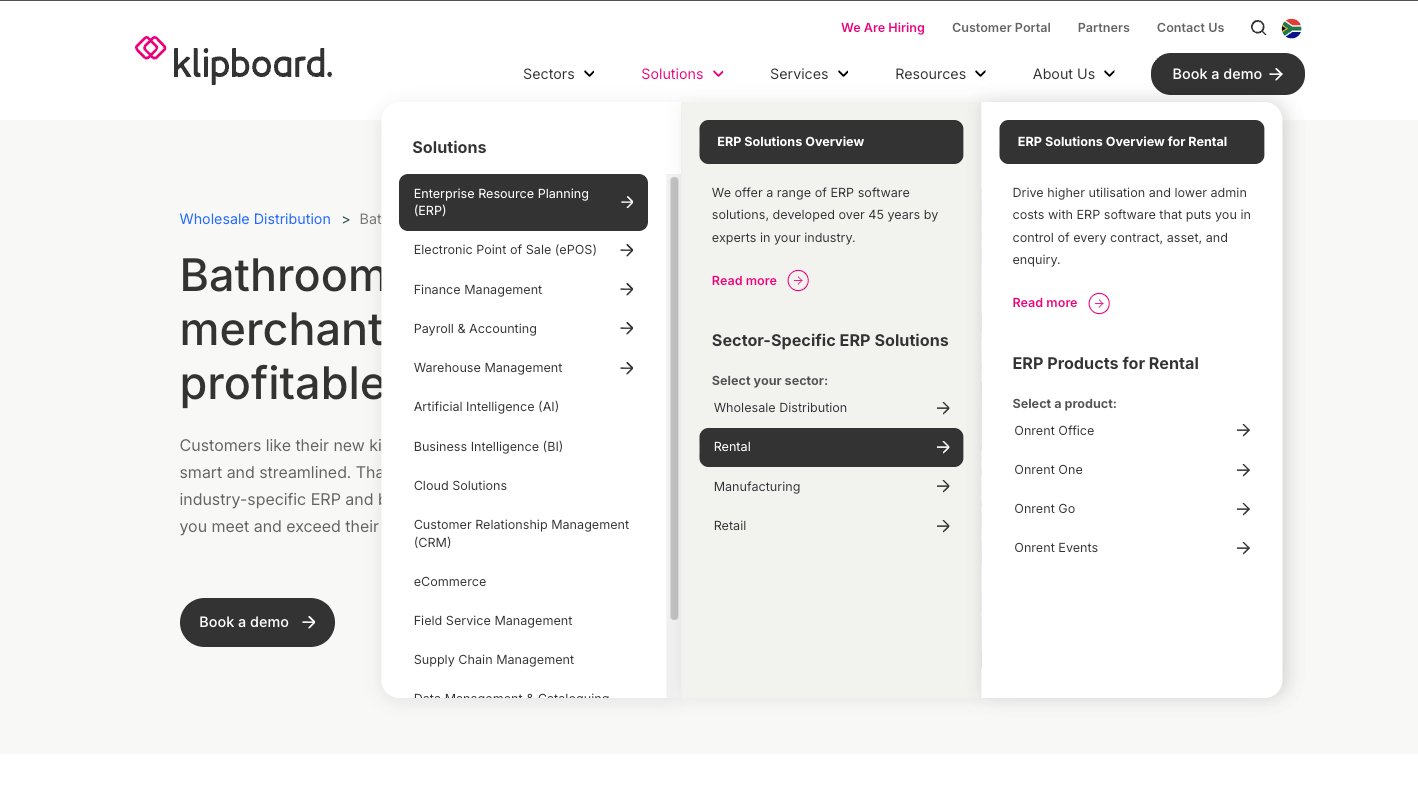
After evaluating feasibility and design consistency, I opted for a dropdown-based product finder tool that combines guided filtering with a quick access design.
Design Decisions
Why a dropdown-based Product Finder and not a quiz or a search bar
Three approaches were evaluated:
- A guided quiz (multi-step "tell us about your business" flow) would have given the most personalised output but introduced significant friction upfront. For a B2B software product where visitors arrive mid-research, asking several questions before showing any content risks abandonment.
- An enhanced search bar would be useful for returning users who know what they want, but fails new visitors who don't yet know Klipboard's product terminology. Searching "field management" returns nothing if Klipboard calls it "field service operations."
- A dropdown filter tool hit the right balance: low commitment, immediate feedback, no dead ends. Users can engage with one dropdown or all three, and the results update accordingly.
Placement and visual hierarchy
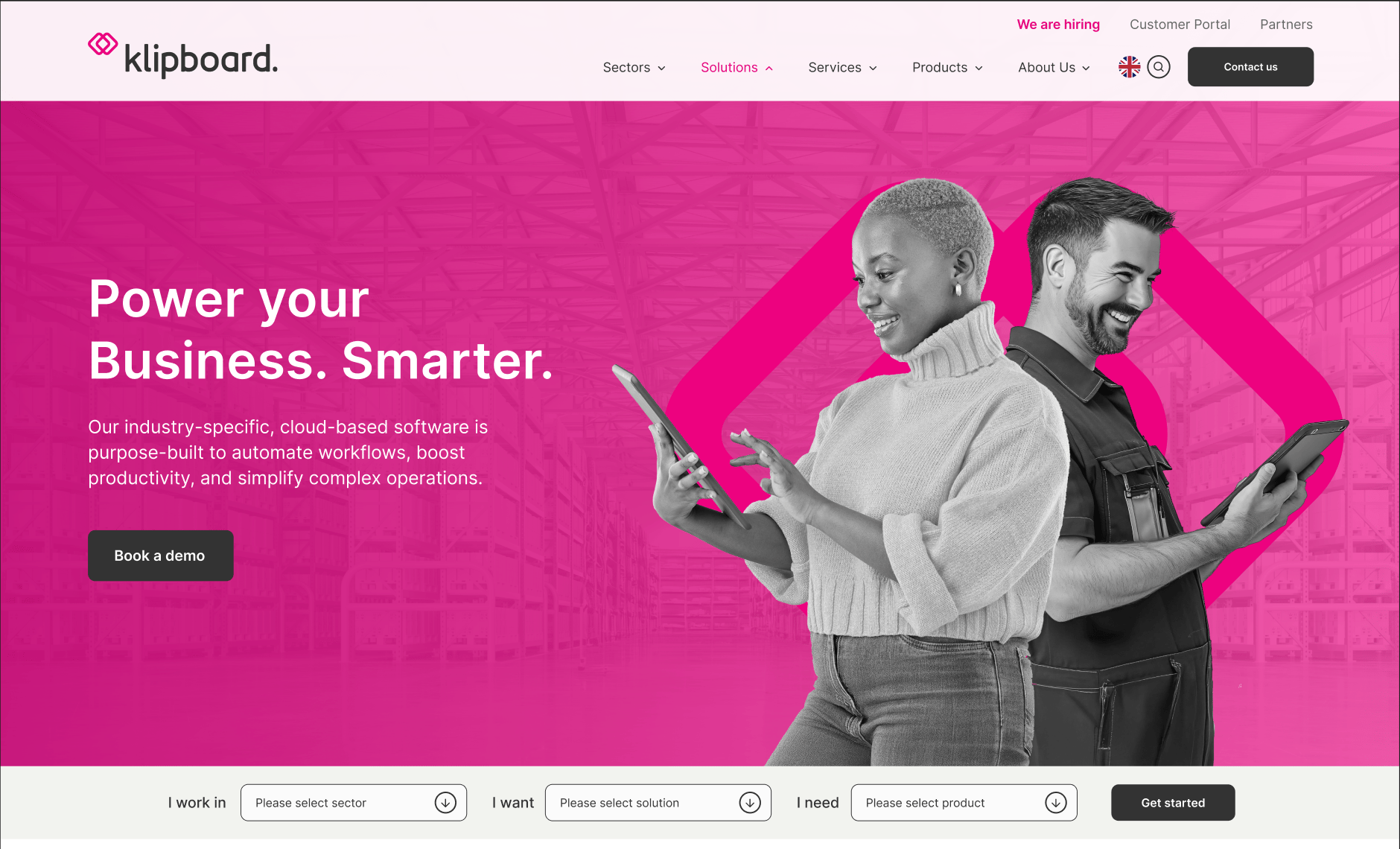
The competitor analysis surfaced a clear pattern: product discovery tools placed above the fold, but below the hero, consistently outperformed those buried in the navigation or footer. Visitors arrive with intent; the tool needed to intercept that intent before they reached the main menu.
The final design positioned the Product Finder directly below the hero section, with enough visual weight to register as a primary interaction point without competing with the hero message.
Scalability as a design constraint
A key requirement was that the tool could absorb new products and categories without a structural redesign. The dropdown architecture was built around this constraint, new options slot into existing categories rather than requiring new UI patterns. This was a deliberate decision made early, and it shaped every subsequent design choice about information architecture and labelling.
Projected Outcomes
Implementation is currently in progress. Based on usability feedback gathered during the design process and stakeholder review, the following outcomes are projected:
- Reduced navigation depth: Users are expected to reach a relevant product or solution page within two clicks, compared to an estimated four to five clicks through the existing main navigation
- Lower menu dependency: Early testing indicated that visitors engage with the Product Finder before exploring the main navigation, suggesting it successfully intercepts discovery intent at the right moment
- Improved content findability for new visitors: The guided filtering approach removes the requirement for visitors to know Klipboard's product terminology before they can find what they need
- Scalability without redesign: The modular structure means new products and categories can be added by updating dropdown content, no UI or structural changes required
Reflection
The most valuable tension on this project was between comprehensiveness and simplicity. Klipboard's instinct, understandably was to surface as much of their product range as possible. My instinct as the designer was to do the opposite: reduce options until every choice felt meaningful.
The competitor analysis gave me the evidence to make that case. Products that tried to show everything upfront consistently created more confusion, not less. That research was what allowed me to advocate for the filtering approach with confidence rather than personal preference.
Thanks for stopping by, Let’s connect


Klipboard Product Finder
Klipboard provides industry-specific, cloud-based ERP and management software solutions for businesses


Industry
Software Development
My role
Timeline:
UI Designer
9 Months (2025 - present)

Context
The Problem
My Role
Research method: Competitor Analysis
Projected Outcomes
Reflection
Design Decisions
Brainstorming and wireframing
Klipboard is a cloud-based ERP and workforce management platform built for field service businesses. Their software covers a broad range of industries, from facilities management and HVAC to construction and logistics, each with their own set of relevant products and solutions.
As Klipboard's product range grew, so did the challenge of helping new visitors find what was actually relevant to them. A visitor landing on the site from a Google search for "field service software" had no structured way to narrow down to the right industry or product without scrolling through a complex main navigation.
Klipboard's existing website navigation had scaled past the point of usability. New visitors struggled to self-identify which product or industry solution matched their needs, while returning users found it difficult to re-locate specific pages quickly. With new product categories planned for the near future, the navigation risked becoming a genuine barrier to conversion, not just a friction point.
The business needed a solution that could handle their current complexity and accommodate future growth without requiring a full navigation redesign every time a new product was added.
As the UI Designer on this project, I was responsible for the end-to-end design of the Product Finder tool, from research and concept through to high-fidelity design and handoff. The initial wireframes were provided by the broader MO Agency design team, which I then took forward into detailed UI design.
With no direct user interviews conducted at this stage, the research phase focused on a structured competitor analysis of software companies offering multiple products across multiple industries, a directly comparable problem space.
I analysed how competitors help users self-identify their needs quickly, where and how product discovery tools are positioned on the page, what interaction patterns they use (filters, guided questions, search, dropdowns), and how visual design supports clarity and decision-making under cognitive load.
What the research revealed:
Most competitors fell into one of two camps. Either they used a flat mega-menu that exposed everything at once (overwhelming for new visitors) or they buried product discovery behind a search bar, which requires users to already know what they're looking for.
Implementation is currently in progress. Based on usability feedback gathered during the design process and stakeholder review, the following outcomes are projected:
- Reduced navigation depth: Users are expected to reach a relevant product or solution page within two clicks, compared to an estimated four to five clicks through the existing main navigation
- Lower menu dependency: Early testing indicated that visitors engage with the Product Finder before exploring the main navigation, suggesting it successfully intercepts discovery intent at the right moment
- Improved content findability for new visitors: The guided filtering approach removes the requirement for visitors to know Klipboard's product terminology before they can find what they need
- Scalability without redesign: The modular structure means new products and categories can be added by updating dropdown content, no UI or structural changes required
The most valuable tension on this project was between comprehensiveness and simplicity. Klipboard's instinct, understandably was to surface as much of their product range as possible. My instinct as the designer was to do the opposite: reduce options until every choice felt meaningful.
The competitor analysis gave me the evidence to make that case. Products that tried to show everything upfront consistently created more confusion, not less. That research was what allowed me to advocate for the filtering approach with confidence rather than personal preference.
Why a dropdown-based Product Finder and not a quiz or a search bar
Three approaches were evaluated:
- A guided quiz (multi-step "tell us about your business" flow) would have given the most personalised output but introduced significant friction upfront. For a B2B software product where visitors arrive mid-research, asking several questions before showing any content risks abandonment.
- An enhanced search bar would be useful for returning users who know what they want, but fails new visitors who don't yet know Klipboard's product terminology. Searching "field management" returns nothing if Klipboard calls it "field service operations."
- A dropdown filter tool hit the right balance: low commitment, immediate feedback, no dead ends. Users can engage with one dropdown or all three, and the results update accordingly.
Placement and visual hierarchy
The competitor analysis surfaced a clear pattern: product discovery tools placed above the fold, but below the hero, consistently outperformed those buried in the navigation or footer. Visitors arrive with intent; the tool needed to intercept that intent before they reached the main menu.
The final design positioned the Product Finder directly below the hero section, with enough visual weight to register as a primary interaction point without competing with the hero message.
Scalability as a design constraint
A key requirement was that the tool could absorb new products and categories without a structural redesign. The dropdown architecture was built around this constraint, new options slot into existing categories rather than requiring new UI patterns. This was a deliberate decision made early, and it shaped every subsequent design choice about information architecture and labelling.
After evaluating feasibility and design consistency, I opted for a dropdown-based product finder tool that combines guided filtering with a quick access design.
The Wireframes were provided by the designers of the MO Agency team.
View more projects

View more projects


Klipboard Product Finder
Klipboard provides industry-specific, cloud-based ERP and management software solutions for businesses
Industry
Software Development
My role
Timeline:
UI Designer
9 Months (2025 - present)

Context
Why a dropdown-based Product Finder and not a quiz or a search bar
Three approaches were evaluated:
- A guided quiz (multi-step "tell us about your business" flow) would have given the most personalised output but introduced significant friction upfront. For a B2B software product where visitors arrive mid-research, asking several questions before showing any content risks abandonment.
- An enhanced search bar would be useful for returning users who know what they want, but fails new visitors who don't yet know Klipboard's product terminology. Searching "field management" returns nothing if Klipboard calls it "field service operations."
- A dropdown filter tool hit the right balance: low commitment, immediate feedback, no dead ends. Users can engage with one dropdown or all three, and the results update accordingly.
Placement and visual hierarchy
The competitor analysis surfaced a clear pattern: product discovery tools placed above the fold, but below the hero, consistently outperformed those buried in the navigation or footer. Visitors arrive with intent; the tool needed to intercept that intent before they reached the main menu.
The final design positioned the Product Finder directly below the hero section, with enough visual weight to register as a primary interaction point without competing with the hero message.
Scalability as a design constraint
A key requirement was that the tool could absorb new products and categories without a structural redesign. The dropdown architecture was built around this constraint, new options slot into existing categories rather than requiring new UI patterns. This was a deliberate decision made early, and it shaped every subsequent design choice about information architecture and labelling.
The Problem
My Role
Research method: Competitor Analysis
Projected Outcomes
Reflection
Design Decisions
Brainstorming and wireframing
Klipboard is a cloud-based ERP and workforce management platform built for field service businesses. Their software covers a broad range of industries, from facilities management and HVAC to construction and logistics, each with their own set of relevant products and solutions.
As Klipboard's product range grew, so did the challenge of helping new visitors find what was actually relevant to them. A visitor landing on the site from a Google search for "field service software" had no structured way to narrow down to the right industry or product without scrolling through a complex main navigation.
Klipboard's existing website navigation had scaled past the point of usability. New visitors struggled to self-identify which product or industry solution matched their needs, while returning users found it difficult to re-locate specific pages quickly. With new product categories planned for the near future, the navigation risked becoming a genuine barrier to conversion, not just a friction point.
The business needed a solution that could handle their current complexity and accommodate future growth without requiring a full navigation redesign every time a new product was added.
As the UI Designer on this project, I was responsible for the end-to-end design of the Product Finder tool, from research and concept through to high-fidelity design and handoff. The initial wireframes were provided by the broader MO Agency design team, which I then took forward into detailed UI design.
With no direct user interviews conducted at this stage, the research phase focused on a structured competitor analysis of software companies offering multiple products across multiple industries, a directly comparable problem space.
I analysed how competitors help users self-identify their needs quickly, where and how product discovery tools are positioned on the page, what interaction patterns they use (filters, guided questions, search, dropdowns), and how visual design supports clarity and decision-making under cognitive load.
What the research revealed:
Most competitors fell into one of two camps. Either they used a flat mega-menu that exposed everything at once (overwhelming for new visitors) or they buried product discovery behind a search bar, which requires users to already know what they're looking for.
Implementation is currently in progress. Based on usability feedback gathered during the design process and stakeholder review, the following outcomes are projected:
- Reduced navigation depth: Users are expected to reach a relevant product or solution page within two clicks, compared to an estimated four to five clicks through the existing main navigation
- Lower menu dependency: Early testing indicated that visitors engage with the Product Finder before exploring the main navigation, suggesting it successfully intercepts discovery intent at the right moment
- Improved content findability for new visitors: The guided filtering approach removes the requirement for visitors to know Klipboard's product terminology before they can find what they need
- Scalability without redesign: The modular structure means new products and categories can be added by updating dropdown content, no UI or structural changes required
The most valuable tension on this project was between comprehensiveness and simplicity. Klipboard's instinct, understandably was to surface as much of their product range as possible. My instinct as the designer was to do the opposite: reduce options until every choice felt meaningful.
The competitor analysis gave me the evidence to make that case. Products that tried to show everything upfront consistently created more confusion, not less. That research was what allowed me to advocate for the filtering approach with confidence rather than personal preference.
After evaluating feasibility and design consistency, I opted for a dropdown-based product finder tool that combines guided filtering with a quick access design.
The Wireframes were provided by the designers of the MO Agency team.


