Altron Website Design
Altron is a leading South African technology group providing integrated IT and digital solutions that help businesses and the public sector improve customer experiences.
Industry
Technology
My role
Timeline:
UI Designer
3 Months (2023-2024)

Context
The Problem
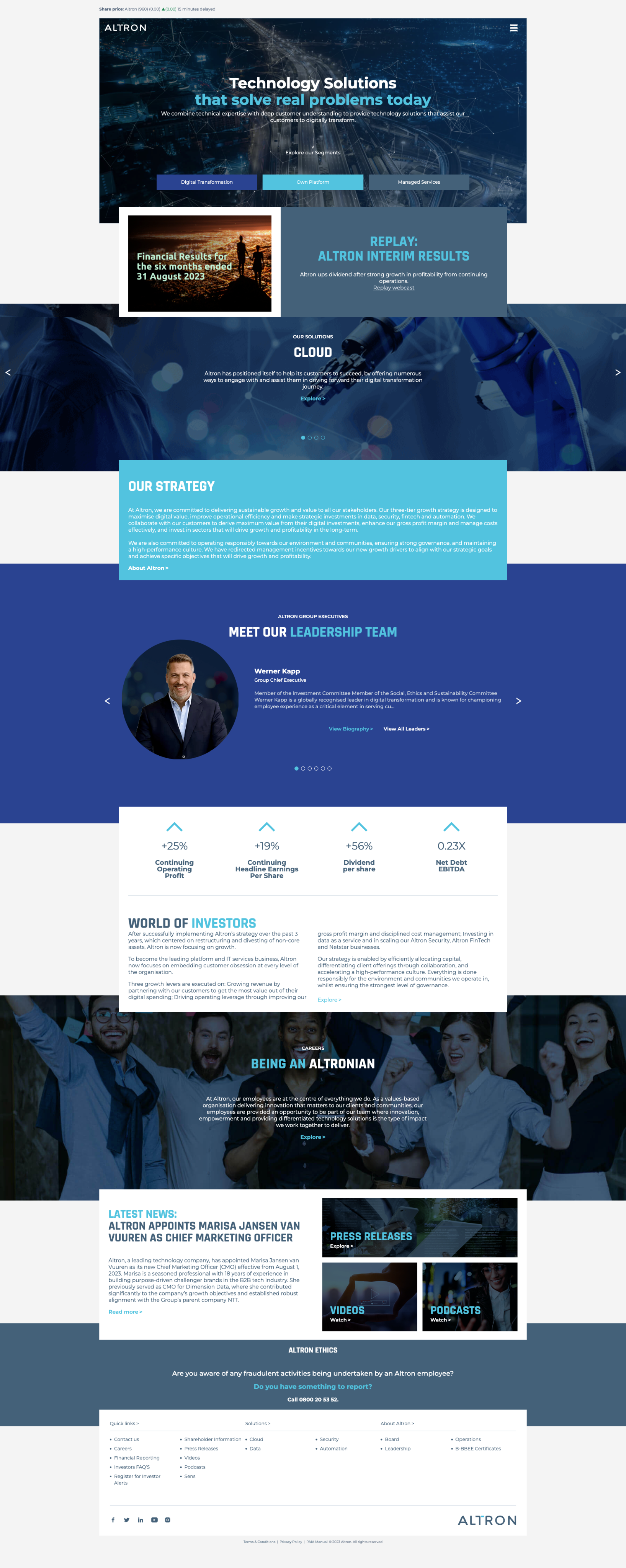
Altron is one of South Africa's largest technology groups, providing integrated IT and digital solutions to both the private sector and public sector clients. The breadth of their offering spanning cybersecurity, cloud, IoT, fintech, and digital transformation services, is a strength commercially, but it created a significant communication problem online.
Over time, Altron's digital presence had grown through acquisition and division-level independence. The result was a fragmented network of standalone WordPress sites, each with its own navigation, visual identity, and content approach that no longer reflected the group as a unified entity. When MO Agency was brought in, the brief was clear: consolidate everything into a single, coherent digital experience that could represent the full weight of the Altron brand.
For external visitors and primarily IT decision-makers, the fragmented structure made it impossible to understand Altron's full offering or find a clear path between related services. Internally, 15 disconnected WordPress sites meant no unified content governance, no shared analytics, and no way to track performance at a group level.
This wasn't a redesign project. It was an architectural problem with a design solution.
My Role
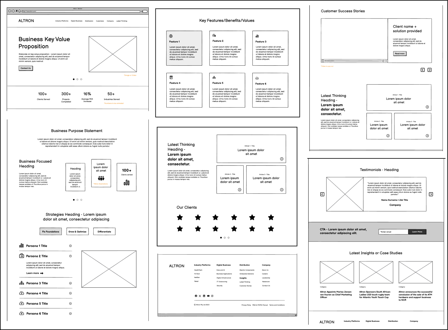
Brainstorming and wireframing
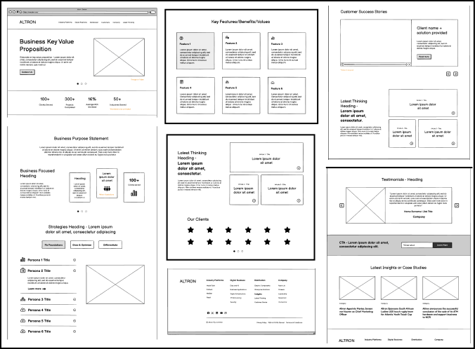
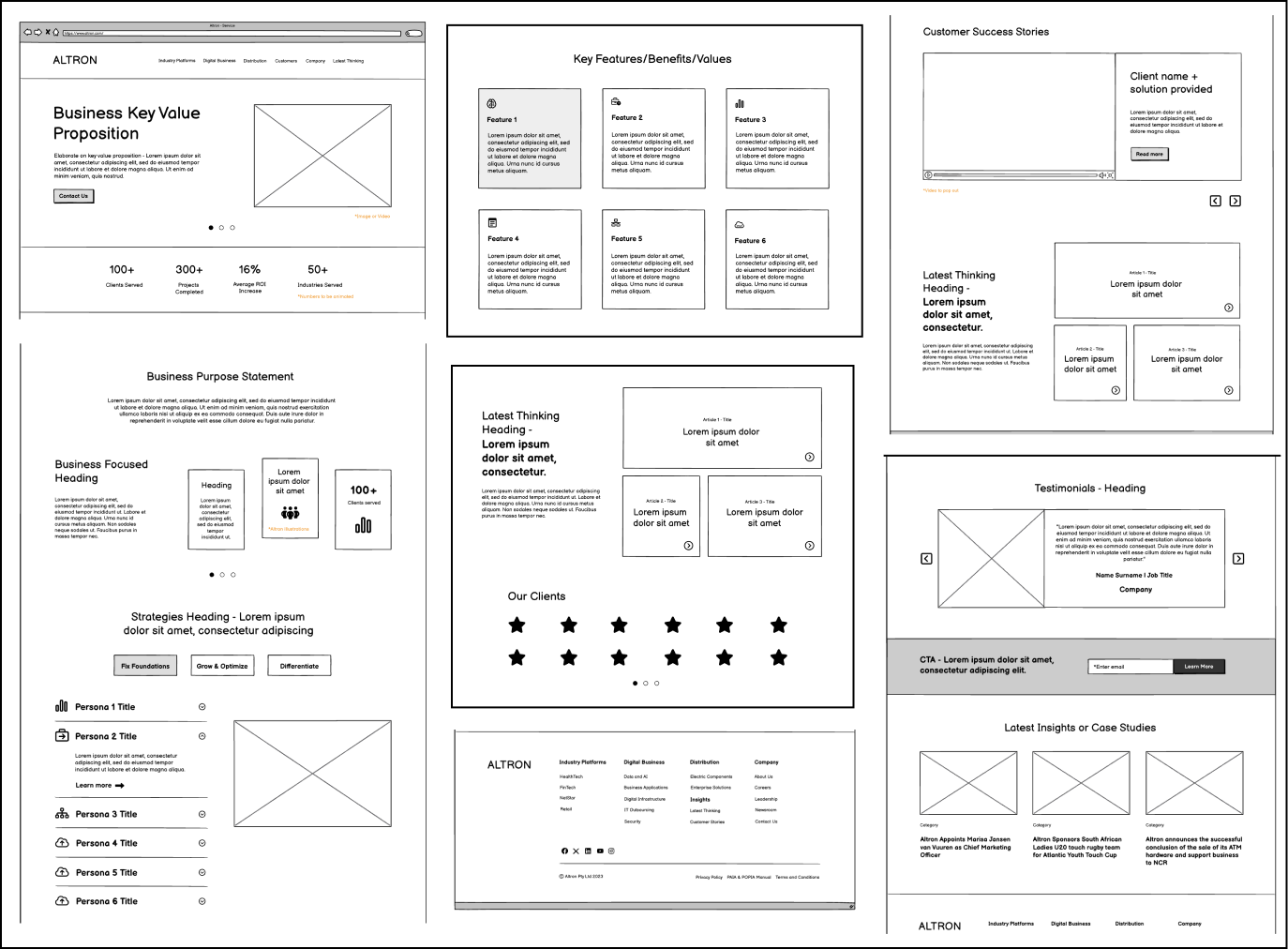
The Wireframes were provided by the designers of the MO Agency team. The process began with defining the mega menu structure, which became the foundation for the entire website architecture.
Three levels of service page templates were developed from high-level business units down to specific service offerings, ensuring a smooth and intuitive content flow. Early wireframes focused on structure and user flow, not aesthetics, to prioritise clarity and navigation.
View more projects

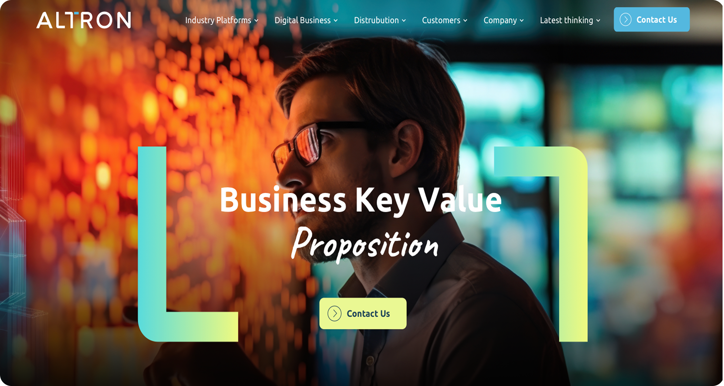
As UI Designer, I was responsible for translating the site architecture and wireframes into a production-ready visual design system on HubSpot CMS, from high-fidelity design through to developer handoff. The strategy and UX team led research and initial wireframes; I owned everything from that point forward.
Key Design Decisions
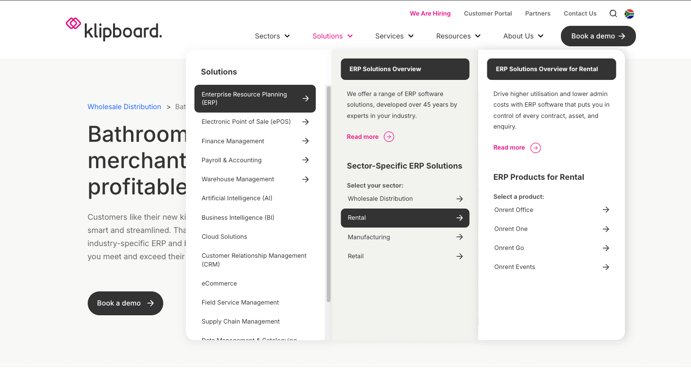
Mega menu first. Rather than starting with the homepage, the project began by defining the mega menu structure. With 35 products across multiple business units, getting the navigation architecture right was the prerequisite for everything else. The menu became the skeleton from which all other template decisions were derived.
Three-tier service page templates. Instead of bespoke pages per product, I developed a three-tier hierarchy: business unit → solution category → specific service, each with its own layout logic but sharing a unified design system. This was as much a governance decision as a design one: Altron's marketing team could publish new services without requiring a designer, which was the most valuable long-term outcome of the project.
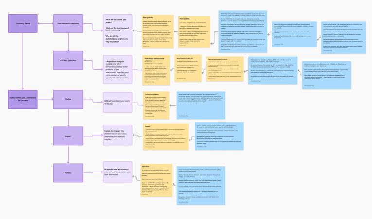
Proof over description. The user journey map, modelling an IT decision-maker from awareness through to conversion, identified the Evaluation stage as the longest and most critical. Enterprise buyers spend the most time comparing and validating. This shifted service page content from product descriptions toward case studies, client logos, certifications, and measurable outcomes: the things that actually influence procurement decisions.
Research
A competitor analysis of enterprise technology brands GE, Seismic, NTT, and Salesforce, surfaced the most important structural insight: the companies that performed best for B2B buyers led with service pathways and outcomes, not internal division names. This directly challenged Altron's default logic of organising the site by business unit, and shaped the decision to restructure around what users needed to find, not how Altron was internally organised.
Salesforce's mega navigation was a specific reference, not for aesthetics, but for how it handled complexity without overwhelming first-time visitors. That progressive disclosure model became the foundation for Altron's site architecture.
Outcome
- 15 WordPress sites consolidated into a single governed HubSpot CMS platform
- Unified navigation giving visitors a clear path from group-level awareness to specific service enquiry
- Group-level analytics and conversion tracking enabled for the first time
- A scalable template system allowing new products to be published without design involvement
Reflection
The three-month timeline meant we relied on competitor analysis and journey mapping for major structural decisions, particularly the shift from division-led to service-led navigation without direct input from Altron's actual customers. Even a small number of interviews with IT decision-makers would have given us stronger evidence for the IA choices.
I'd also push for a content audit and governance framework before finalising templates. Several late-stage revisions were driven by content decisions that should have been made earlier, naming conventions, page hierarchies, content priorities. Locking those down upfront would have reduced rework and produced a stronger result.


Thanks for stopping by, Let’s connect


View more projects


Altron Website Design
Altron is a leading South African technology group providing integrated IT and digital solutions that help businesses and the public sector improve customer experiences.


Industry
Technology
My role
Timeline:
UI Designer
3 Months (2023-2024)

Context
The Problem
My Role
Outcome
Reflection
Key Design Decisions
Brainstorming and wireframing
Altron is one of South Africa's largest technology groups, providing integrated IT and digital solutions to both the private sector and public sector clients. The breadth of their offering spanning cybersecurity, cloud, IoT, fintech, and digital transformation services, is a strength commercially, but it created a significant communication problem online.
Over time, Altron's digital presence had grown through acquisition and division-level independence. The result was a fragmented network of standalone WordPress sites, each with its own navigation, visual identity, and content approach that no longer reflected the group as a unified entity. When MO Agency was brought in, the brief was clear: consolidate everything into a single, coherent digital experience that could represent the full weight of the Altron brand.
For external visitors and primarily IT decision-makers, the fragmented structure made it impossible to understand Altron's full offering or find a clear path between related services. Internally, 15 disconnected WordPress sites meant no unified content governance, no shared analytics, and no way to track performance at a group level.
This wasn't a redesign project. It was an architectural problem with a design solution.
As UI Designer, I was responsible for translating the site architecture and wireframes into a production-ready visual design system on HubSpot CMS, from high-fidelity design through to developer handoff. The strategy and UX team led research and initial wireframes; I owned everything from that point forward.
- 15 WordPress sites consolidated into a single governed HubSpot CMS platform
- Unified navigation giving visitors a clear path from group-level awareness to specific service enquiry
- Group-level analytics and conversion tracking enabled for the first time
- A scalable template system allowing new products to be published without design involvement
The three-month timeline meant we relied on competitor analysis and journey mapping for major structural decisions, particularly the shift from division-led to service-led navigation without direct input from Altron's actual customers. Even a small number of interviews with IT decision-makers would have given us stronger evidence for the IA choices.
I'd also push for a content audit and governance framework before finalising templates. Several late-stage revisions were driven by content decisions that should have been made earlier, naming conventions, page hierarchies, content priorities. Locking those down upfront would have reduced rework and produced a stronger result.
Mega menu first. Rather than starting with the homepage, the project began by defining the mega menu structure. With 35 products across multiple business units, getting the navigation architecture right was the prerequisite for everything else. The menu became the skeleton from which all other template decisions were derived.
Three-tier service page templates. Instead of bespoke pages per product, I developed a three-tier hierarchy: business unit → solution category → specific service, each with its own layout logic but sharing a unified design system. This was as much a governance decision as a design one: Altron's marketing team could publish new services without requiring a designer, which was the most valuable long-term outcome of the project.
Proof over description. The user journey map, modelling an IT decision-maker from awareness through to conversion, identified the Evaluation stage as the longest and most critical. Enterprise buyers spend the most time comparing and validating. This shifted service page content from product descriptions toward case studies, client logos, certifications, and measurable outcomes: the things that actually influence procurement decisions.
The Wireframes were provided by the designers of the MO Agency team. The process began with defining the mega menu structure, which became the foundation for the entire website architecture.
Three levels of service page templates were developed from high-level business units down to specific service offerings, ensuring a smooth and intuitive content flow. Early wireframes focused on structure and user flow, not aesthetics, to prioritise clarity and navigation.
Research
A competitor analysis of enterprise technology brands GE, Seismic, NTT, and Salesforce, surfaced the most important structural insight: the companies that performed best for B2B buyers led with service pathways and outcomes, not internal division names. This directly challenged Altron's default logic of organising the site by business unit, and shaped the decision to restructure around what users needed to find, not how Altron was internally organised.
Salesforce's mega navigation was a specific reference, not for aesthetics, but for how it handled complexity without overwhelming first-time visitors. That progressive disclosure model became the foundation for Altron's site architecture.
View more projects


Altron Website Design
Altron is a leading South African technology group providing integrated IT and digital solutions that help businesses and the public sector improve customer experiences.
Industry
Technology
My role
Timeline:
UI Designer
3 Months (2023-2024)

Context
The Problem
My Role
Outcome
Reflection
Key Design Decisions
Brainstorming and wireframing
Research
Altron is one of South Africa's largest technology groups, providing integrated IT and digital solutions to both the private sector and public sector clients. The breadth of their offering spanning cybersecurity, cloud, IoT, fintech, and digital transformation services, is a strength commercially, but it created a significant communication problem online.
Over time, Altron's digital presence had grown through acquisition and division-level independence. The result was a fragmented network of standalone WordPress sites, each with its own navigation, visual identity, and content approach that no longer reflected the group as a unified entity. When MO Agency was brought in, the brief was clear: consolidate everything into a single, coherent digital experience that could represent the full weight of the Altron brand.
For external visitors and primarily IT decision-makers, the fragmented structure made it impossible to understand Altron's full offering or find a clear path between related services. Internally, 15 disconnected WordPress sites meant no unified content governance, no shared analytics, and no way to track performance at a group level.
This wasn't a redesign project. It was an architectural problem with a design solution.
As UI Designer, I was responsible for translating the site architecture and wireframes into a production-ready visual design system on HubSpot CMS, from high-fidelity design through to developer handoff. The strategy and UX team led research and initial wireframes; I owned everything from that point forward.
A competitor analysis of enterprise technology brands GE, Seismic, NTT, and Salesforce, surfaced the most important structural insight: the companies that performed best for B2B buyers led with service pathways and outcomes, not internal division names. This directly challenged Altron's default logic of organising the site by business unit, and shaped the decision to restructure around what users needed to find, not how Altron was internally organised.
Salesforce's mega navigation was a specific reference, not for aesthetics, but for how it handled complexity without overwhelming first-time visitors. That progressive disclosure model became the foundation for Altron's site architecture.
- 15 WordPress sites consolidated into a single governed HubSpot CMS platform
- Unified navigation giving visitors a clear path from group-level awareness to specific service enquiry
- Group-level analytics and conversion tracking enabled for the first time
- A scalable template system allowing new products to be published without design involvement
The three-month timeline meant we relied on competitor analysis and journey mapping for major structural decisions, particularly the shift from division-led to service-led navigation without direct input from Altron's actual customers. Even a small number of interviews with IT decision-makers would have given us stronger evidence for the IA choices.
I'd also push for a content audit and governance framework before finalising templates. Several late-stage revisions were driven by content decisions that should have been made earlier, naming conventions, page hierarchies, content priorities. Locking those down upfront would have reduced rework and produced a stronger result.
Mega menu first. Rather than starting with the homepage, the project began by defining the mega menu structure. With 35 products across multiple business units, getting the navigation architecture right was the prerequisite for everything else. The menu became the skeleton from which all other template decisions were derived.
Three-tier service page templates. Instead of bespoke pages per product, I developed a three-tier hierarchy: business unit → solution category → specific service, each with its own layout logic but sharing a unified design system. This was as much a governance decision as a design one: Altron's marketing team could publish new services without requiring a designer, which was the most valuable long-term outcome of the project.
Proof over description. The user journey map, modelling an IT decision-maker from awareness through to conversion, identified the Evaluation stage as the longest and most critical. Enterprise buyers spend the most time comparing and validating. This shifted service page content from product descriptions toward case studies, client logos, certifications, and measurable outcomes: the things that actually influence procurement decisions.
The Wireframes were provided by the designers of the MO Agency team. The process began with defining the mega menu structure, which became the foundation for the entire website architecture.
Three levels of service page templates were developed from high-level business units down to specific service offerings, ensuring a smooth and intuitive content flow. Early wireframes focused on structure and user flow, not aesthetics, to prioritise clarity and navigation.